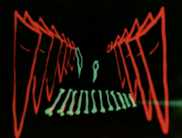
Len Lye, Tusalava, 1929 (9 min)
The series of organic shapes flitting about and/or slithering by was as though looking through a microscope at cells dividing and recombining. The split screen created narrow passages for these cell-like shapes to travel, suggesting the material that travels through every living beings veins. As the film continues, the "cell" become representations of tribal art. It seems that Len Lye was making a connection to the essential material of living beings and how tribal cultures represented their world through pictographs --- getting to the essence of themselves.
There are a versions on Vimeo, one supposedly uses the "correct" music, but the visuals of both are reversed horizontally and/or the greyscale.
Len Lye, A Color Box, 1935 (3 min)
This might be my favourite Len Lye film and it is a commercial of all things (why can we not have commercials this "cool" now?) Every time I see this film I could swear Lye was in the same room as the musicians playing and he was able to capture the energy of the music, literally peel it off the air, and reapply it on celluloid.
Len Lye, Trade Tattoo. 1937 (5 min)
Another commission by the G.P.O., but this one is more in a documentary fashion. This time there is manipulated film stock of factory and mail workers, with a layer of animation over it, all moving in time to the rhythm. Even the use of text flowed in the same manner as the other visuals. "The rhythm of trade is maintained by the mails" is one textual example used repeatedly.
Len Lye, Free Radicals, 1958 (4 min)
The horizontal, sharply wavy scratches into the emulsion resonated the sound of the drum, making the sound waves dance across the visual plane. Lye was able to achieve an almost 3D effect while the line(s) rotated. The precession of line work to the beat of the drum and especially the line/shape pulses, at the point of impact from the hand on the drum, is stunning.
Mary Ellen Bute, Synchromy No. 4: Escape. 1938 (4 min)
Even without the title card stating, "a story in abstraction of an orange/red triangle imprisoned behind a grid of vertical and horizontal lines under a sky-blue expanse, perhaps representing freedom", the visuals make a clear statement of < insert entity here > trying to gain freedom. There is one orange triangle taking a stand against that which is keeping it contained. The musical voice give to the orange triangle and the lines/fence creates a dialogue or an argument between the two. When the orange triangle is free it swells, filling the frame as if to say, "I triumphed!", thus making way for the rest of the orange triangle to flee together.
Mary Ellen Bute and Norman McLaren (animator), Spook Sport: A Graveyard Gambol. 1940 (8 min)
Norman McLaren drew actual characters, spooks, ghosts and bats, rather than abstracted representations for a character for this "new film-ballet"; albeit there were times these actual characters went in and out of abstraction. There also was a clear story line, not just visual music, the spooks and ghosts dancing during the night with the bats flying around them, all after the bell tolls 12. With this said, the visuals still move to the rhythm of the music.
Norman McLaren, Boogie Doodle. 1940 (4 min)
Just when you think the whole animation is going to keep time with the music, it does not. There is a lot of interpretation, like dance, to the feel and tone of the music. The visuals do, however, keep up with the upbeat fast pace of the music, especially the blue "piano" lines (I call them this because they reference the piano notes). I also found the switch from red background to blue when the music shifted key (if I have the correct musical term) rather interesting and that it is the same blue colour for the "piano" lines. What I find more interesting is the choice of the colour blue as I see blue piano music.
Norman McLaren, Synchromy. 1971 (7 min)
I could not help but think of the scene from Close Encounters of the Third Kind (1977) when the Mothership is teaching the scientists their tonal/visual language. McLaren is showing us tonal differences by modifying the size of the animated horizontal lines. If one was to mute the sound or if the soundtrack was damaged, the visuals will demonstrate the pitch of the sound. McLaren not only created the visuals (which were possibly optically printed as is suggested in the opening credits), but he also created the soundtrack by scratching directly into the soundtrack space on the film (at least this his how he did this on other cameraless films).


I enjoyed your call for "cooler" advertising, which in this case means ads featuring avant-garde techniques. I immediately thought of one trend I had noted in recent commercials: the visible words.
ReplyDelete(http://www.youtube.com/watch?v=KnfE5zODgak). This technique seems to be the descendant of a 1950s-60s avant-garde technique that has resurfaced in both contemporary popular culture and avant-garde digital poetry.
Thanks for your example.
ReplyDelete